Clearing the Mist

Clearing the Mist is real-time commentary by Delphi Advisors on developments, clues, patterns, and events we believe could affect the U.S. economy, and particularly the Forest Products sector...

...or sometimes it's just a way to let off some steam.


Thursday, September 4, 2014

QFR Paper Manufacturing – 2014 First Quarter

With this post we are initiating coverage of the Census Bureau’s Quarterly Financial Review data for the U.S. paper manufacturing industry. Each quarter the Census Bureau samples a broad array of U.S. corporations to gather a snapshot of business sector health and activity. The program, known as the Quarterly Financial Report, or QFR, survey has been collected and published for over sixty years by various Federal agencies, the Census Bureau being the current administrator of the program. These data provide a standardized and comprehensive look at the financial condition of the industry.

Results from sampled businesses are aggregated and reported by the North American Industry Classification System (NAICS) and by asset size category. There are separate NAICS codes for wood product manufacturing (“321”) and paper manufacturing (“322”). Based upon returned sample surveys, the QFR presents estimated statements of income and retained earnings, balance sheets, and related financial and operating ratios by industry sector and asset size category. What’s reported in this blog is only a snapshot of the other data reported by the QFR survey.

The paper manufacturing data is categorized by asset size: firms with less than 25 million dollars in assets (“small firms”), firms with more than 25 million in assets (“large firms”), and all firms regardless of size. While the data is somewhat dated, it provides a useful perspective on business direction and momentum with respect to the current cycle as well as providing benchmarks for individuals firm’s performance.


 (For Larger Image Click on Graph)

Viewing the 2014Q1 data, the picture that emerges is a gradually improving industry sector that was hampered by adverse 2014Q1 weather conditions, which have been widely reported by the financial media as the principal cause behind 2014Q1's negative real GDP print. Comparisons to the prior quarter (2013Q4) are further complicated by significant non-operating income and a significant federal tax credit received in 2013Q4. Granting these complications to in-depth interpretation of 2014Q1 industry results, probably the most significant observation is although year-over-year industry net sales increased by 5.5%, operating margins fell, dropping from 5.74% in 2013Q1 to 3.49% in 2014Q1. However, despite loss of operating margin, the industry’s focus on asset rationalization has maintained both ROE and ROA in the solidly within the upper quartile of performance relative to the past 10 years.

Selected financial results of paper manufacturers’ first quarter 2014 is summarized in the table shown below. Notable highlights (see table below) include:

  • Net Sales – 2014Q1 net sales ($32.9 billion) retreated by 3.2 percent compared to 2013Q4’s net sales, a reduction approximately three times larger (more negative) than the median reduction seen between Q4 and Q1 over the past ten years. Despite dropping from 2013Q4’s sales, 2014Q1’s net sales increased by 5.5% compared to 2013Q1’s net sales level.
  • EBITDA – 2014Q1 operating cash-flow, or Earnings Before Interest, Taxes, Depreciation, and Amortization (EBITDA), posted 10-year lows for both large firms and the industry.
  • Operating Income – 2014Q1 operating income was in lower quartile of last 10 years for industry and both large and small firms.
  • Pre-tax Income – 2014Q1 pre-tax income posted significant declines to 2013Q4, dropping nearly 52 percent compared to a 10 year average percentage change between Q4 and Q1 of nearly 12%.
  • Net Income – 2014Q1 net income posted significant declines on both a quarter-over-quarter basis as well as on a year-over-year basis. As noted earlier, quarter-over-quarter comparisons are complicated by large non-operating income received in 2013Q4. However, year-over-year comparisons don’t suffer from this issue and point to significant cost structure increases in 2014Q1 vs. 2013Q1: year-over-year sales improved by $1.7 billion while net income fell by $0.9 billion, a combined implied cost delta of $2.6 billion, or 8.3% on 2013Q1 sales of $31.2 billion.
  • Operating Margins – 2014Q1 operating margins showed significant erosion across the board on both quarter-over-quarter and year-over-year comparisons.
  • ROE and ROA – Despite apparently increasing operating costs both Return on Equity (ROE) and Return on Assets (ROA) posted year-over-year increases and were in the upper quartile of performance relative to the past 10 years.


(For Larger Image Click on Table)

The key unknown for the industry sector is how much of the increase in 2014Q1 operating costs was attributable to the adverse weather conditions that were blamed for the negative GDP change. The fact 2014Q1 sales contracted from 2013Q4’s net sales level by more than the median percentage between Q4 and Q1 over the past 10 years is consistent with adverse weather impacts. However, 2014Q1’s net sales increase relative to 2013Q1’s net sales potentially challenges weather as the principle explanation for 2014Q1’s EBITDA, operating income, pre-tax income, and net income declines. The second quarter data, due to be released mid-September, will provide additional insights into the industry’s trajectory this business cycle.


QFR Wood Products Manufacturing – 2014 First Quarter

With this post we are initiating coverage of the Census Bureau’s Quarterly Financial Review (QFR) data for the U.S. wood products industry. Each quarter the Census Bureau samples a broad array of U.S. corporations to gather a snapshot of business sector health and activity. The program, known as the Quarterly Financial Report, or QFR, survey has been collected and published for over sixty years by various Federal agencies, the Census Bureau being the current administrator of the program. These data provide a standardized and comprehensive look at the financial condition of the industry.

Results from sampled businesses are aggregated and reported by the North American Industry Classification System (NAICS) and by asset size category. There are separate NAICS codes for wood product manufacturing (“321”) and paper manufacturing (“322”). Based upon returned sample surveys, the QFR presents estimated statements of income and retained earnings, balance sheets, and related financial and operating ratios by industry sector and asset size category. What’s reported in this blog is only a snapshot of the other data reported by the QFR survey.


The wood products manufacturing data is categorized by asset size: firms with less than 25 million dollars in assets (“small firms”), firms with more than 25 million in assets (“large firms”), and all firms regardless of size. While the data is somewhat dated, it provides a useful perspective on business direction and momentum with respect to the current cycle as well as providing benchmarks for individuals firm’s performance.


(Click on Chart for a Larger Image)

Viewing the 2014Q1 data, the picture that emerges is an industry that may have already peaked for this cycle in terms of financial performance. Yet caution is in order: the very tentative housing recovery following the Great Recession could well offer surprises in terms of shape and trajectory of this business cycle. Further, as has been well publicized in the financial media, weather effects were notable in 2014Q1 and these too could be impacting financial results. However, as the graph below shows, net sales have been declining since 2013Q2. Likewise, on trend over the past 12 quarters EBITDA, operating income, and net income increased through 2013Q2 but since then have traced a downward trend. Note net income, operating income, and EBITDA for the weather-affected 2014Q1 is greater than 2013Q4’s (prior quarter) results and roughly on par with 2013Q1’s (prior year) results.


Selected financial results of wood products manufacturers’ first quarter 2014 is summarized in the table shown below. Notable highlights (see table below) include:

  • Net Sales - 2014Q1 net sales ($19.3 billion) fell by 4.2% relative to 2013Q4 net sales. Because the wood products industry is highly cyclical, the median Q4 to Q1 change over the past 10 years is computed and shown in the tenth column of the table for the entire industry to facilitate quarter over quarter comparisons. The 2014Q1 drop in net sales from 2013Q4 is greater than the median Q4 to Q1 drop over the past 10 years (-4.2% vs. -3.6%). On a year-over-year basis, the industry showed a slight increase (+0.5%). The increase in net sales was concentrated on firms with assets less than $25 million (+3.4%) while net sales contracted in aggregate for firms with assets greater than $25 million (-1.2%). 
  • EBITDA – 2014Q1 operating cash-flow was in the upper quartile of 10-year quarterly performance for all firms, regardless of size. Despite relatively high financial performance compared to the prior 10 years, EBITDA still fell on a year-over-year basis.
  • Operating Income –2014Q1 operating income for small firms more than doubled (+115.8%) from 2014Q4’s level while large firms’ operating income increased by 12.3%. Despite the explosive quarter-over-quarter change for small firms, year-over-year operating income expanded by less than 1%. Large firms’ operating income fell by over 8% on a year-over-year basis. The composite results for the industry showed a decline of nearly 5% on a year-over-year basis.
  • Pre-tax Income – 2014Q1 pre-tax income increased by over 140% compared to 2013Q4 for all firms and sizes, nearly three times the median quarter-over-quarter increase between Q4 and Q1 over the past 10 years.
  • Net Income – Despite small firms’ 2014Q1 net income more than quadrupling 2013Q4’s level, year over year net income still fell by nearly 9 percent. Large firms’ quarter-over-quarter performance, a more than 50 percent increase, registered solid positive year-over-year results as well, pulling industry-wide net income high enough to post a year-over-year expansion of 4.4% in net income.
  • Operating Margins – Improved for all firms on a quarter-over-quarter basis but declined for all firms on a year-over-year basis. Despite year-over-year declines, margins were still in the upper 30 percentile compared to the past 10 years, posting an industry average over 8%.
  • ROE and ROA – Despite Return on Equity (ROE) and Return on Assets (ROA) for small firms falling on a quarter-over-quarter their levels remain in upper 15 percentile of the past 10 years of financial performance. Year-over-year performance for the industry as a whole showed improvement, posting 15.42% and 5.76% for ROE and ROA, respectively.


(click on Table for a Larger Image)

Second quarter data, which is released the middle of September, will provide important information on either dispelling concerns the peak for this cycle has already been achieved or that recent performance was simply the market grabbing a breath before launching higher still.

Thursday, March 14, 2013

And we have a new “WAHT” Award Winner*…

*for more about the WAHT Award, click here

Take a deep breath, pour yourself a fresh cup of coffee, or whatever is your beverage of choice to relax with, start the song (right click and select open in a new tab or window to avoid navigating away from this page), and read the article, “A few reasons to be optimistic about the U.S. economy.”  I’m sure you’ll begin to feel much better.
Then, when you’re ready to stop basking in fairytales and return to the real world, ask yourself:
1) If U.S. Healthcare cost increases are slowing due to something other than the economy, how does one explain a global slowdown in healthcare costs?  Is the global slowdown also slowing due to the prospect of implementing ObamaCare in 2014?  The proposition seems dubious.  Further, even if the slowdown is for a reason other than the weak economy, does it really provide a boost to the broader economy when the pace of spending increase is still greater than the pace of increase in U.S. private worker pay?
2) It certainly appears that after six long years the U.S. Housing sector is definitely getting better (fingers crossed; registration required to view link).  However, in the “WAHT award-winning” article there seems to be a view the Federal Reserve’s interest rate policy is separate from what the economy does.  Said another way, if the housing improvement translates into what is described as “really turns around,” won’t the Federal Reserve raise its “super-low interest rates” to avoid overheating the economy?  And why are interest rates still so low?  Is it for housing, or for another reason?  Concern has already been expressed over maintaining low interest rates in the present economic environment by some Federal Reserve presidents, although those sharing this view are in a minority among voting members this year
Recent comments from Chairman Bernanke address these issues (emphasis added).  The first issue is why interest rates are still low:
“If, as the FOMC anticipates, the economic recovery continues at a moderate pace, with unemployment slowly declining and inflation expectations remaining near 2 percent, then long-term interest rates would be expected to rise gradually toward more normal levels over the next several years. This rise would occur as the market's view of the expected date at which the Federal Reserve will begin the removal of policy accommodation draws nearer and then as accommodation is removed. Some normalization of the term premium might also contribute to a rise in long-term rates.”
The key to note here is not a word about the housing market.  The Fed’s accommodative policy is principally due to high unemployment levels and, secondarily, a fear of deflation. So, by keeping rates low and policy lax, the Fed hopes to maintain some inflation in the face of significant economic slack. 
The second issue is: What happens if the economy begins to strengthen if, say, an improving housing market provides added spark:
“If, as the FOMC anticipates, the economic recovery continues at a moderate pace, with unemployment slowly declining and inflation expectations remaining near 2 percent, then long-term interest rates would be expected to rise gradually toward more normal levels over the next several years. This rise would occur as the market's view of the expected date at which the Federal Reserve will begin the removal of policy accommodation draws nearer and then as accommodation is removed. Some normalization of the term premium might also contribute to a rise in long-term rates.”
Two observations on the quote above:  1) The reason rates are low is because the economy is weak. When the economy isn’t weak interest rates won’t remain low, they’ll increase.  Why?  Because 2) central banks need to meet their price stability mandates and leaving rates low won’t allow that to happen.  So, when interest rates finally begin to increase again, what happens to interest payments on the U.S. debt?  I suspect a new crisis unfolds.
3) The WAHT award winner hypothesizes our recent episodes of "genuine malgovernancewere caused by the “extraordinary stresses the recession put on the political system”…. how quaint.  I turn to Mark Twain’s (1836 to 1910, RIP) quote:  “Suppose you were an idiot, and suppose you were a member of Congress; but I repeat myself.”  I’m guessing Mark Twain wasn’t prophesying about today’s federal government but instead lamenting the one of his day.  I’m not holding out much hope we’re seeing a sea change on this one.
4) U.S. Corporate profits are strong -- and that’s a good thing -- but it appears one of the reasons they’re strong is due to corporations paying lower wages.  This isn’t a shocking result given labor slack.  However, U.S. consumers need disposable income if they’re going to buy the things that drive corporate sales that result in corporate profits.  But U.S. households have been losing ground on that score for some time; real disposable income is down as well, both in aggregate as well as on a per capita basis.  Thus, the current situation doesn’t seem particularly sustainable.
5) Neither Europe nor China appears to be tumbling off an economic cliff...Cómo?   While China may not be falling off an economic cliff, it certainly isn’t roaring and substantial risks remain as it navigates from an investment- and export-led economy to a consumer-driven economy.  However, characterizing that Europe isn’t falling off an economic cliff makes me wonder what our WAHT award winner is reading about the European economy because it clearly isn’t what I’m reading.  While much of the mainstream media likes to proclaim the crisis is over, it seems it doesn’t take long for the crisis pop right back up again, which makes me suspect it never really left in the first place.  Informed opinion seems to agree the Euro crisis is far from over too;  unemployment conditions economic data, and recent political events seem to indicate there is little prospect of resolution any time soon.
6) Two other suggestions, that technology will deliver job and wage growth and the U.S. is on the threshold of an "insourcing boomseem speculative at present.
In fact, one of the mechanisms providing the aforementioned record corporate profits is productivity-enhancing technology -- resulting in lower wages being paid.  Frequently the direct pay-off for such technology is worker displacement.  I don’t argue against this because such creative destruction (i.e., innovation) is needed for American enterprise to remain globally competitive.  I simply highlight that these two points of optimism are somewhat contradictory.
As far as being on the threshold of an “insourcing boom,” I appreciate the quip: “anecdotes aren’t data.”  I'm glad for the people of Louisville, Kentucky who are benefiting from General Electric's decision to bring manufacturing jobs back to their Appliance Park facility.  But a company making some decisions, even one as big as GE, doesn't mean a new era is upon us.  The "tale of the tape" for either technology or insourcing will be if job growth accelerates; so far the jury is out on that score despite February’s favorable employment job growth print.
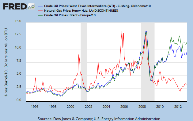
7) The point about natural gas prices is definitely a positive for U.S. growth prospects going forward.  I’ll spare readers the pessimism of “malgoverance” finding a way to turn a positive into a negative.  After all, this post is about feeling optimistic and earlier it was posited by the WHAT award-winning article the period of “genuine malgoverance” may indeed be behind us.  I will, however, point out the inevitable -- but positive, assuming no added regulatory burden -- that natural gas prices will increase.  That is because given the recent divergence between crude oil and natural gas prices, consumption will shift away from crude oil and toward natural gas.  On a net basis that will result in lower energy costs -- a good thing for the U.S. economy.

8) The final point, that U.S. consumer confidence as measured by Gallup is up from where it was during the recession, is definitely true.  But saying that is a bit like (to use a basketball analogy since March Madness is nearly upon us) commenting at 3 minutes into the second half your team is staging a comeback because they’ve narrowed the opponent’s lead by 8 points since halftime.  But the lead at halftime was 35 points -- still a long way to go.

The great enemy of the truth is very often not the lie, deliberate, contrived and dishonest, but the myth, persistent, persuasive and unrealistic.
                                                                    John F. Kennedy

The result of this deception Is very strange to tell,
For when I fool the people I fear, I fool myself as well!
                              Selected lyrics from “Whistle a Happy Tune”
                              Oscar Hammerstein II, lyrist


Thursday, December 20, 2012

Levitating

Levitating. Lev-i-tat-ing. To rise or cause to rise into the air and float in apparent defiance of gravity.

On December 20, 2012 the Bureau of Economic Analysis (BEA) announced the third (“final”) estimate of 2012.Q3 real change in GDP at 3.1 percent, up from the advance/first estimate of 2.0 percent announced the end of October and from the second estimate of 2.7 percent announced the end of November.

Our general view of the U.S. economy is that it has been on a glide path towards another recession – in fact, our forecasts called for the recession to potentially have started by now. As can be seen in the graph below, until these latest revisions, the data of since 2011.Q4 has certainly been consistent with our forecast perspective.

Click on Image to Enlarge
But, as can also be seen, we have been on a similar glide path once before during the current business cycle. Between 2009.Q4 to 2010.Q3 the economy’s momentum was stalling even with over $800 billion of Federal ARRA stimulus (shaded region on the graph above) being fed into its veins. The scheduled reduction in Federal stimulus spending, combined with slowing growth in real disposal income starting in 2010.Q2, seemed to indicate a nearly unavoidable recession was on the near horizon.

In fact, a recession seemed so unavoidable the Economic Cycles Research Institute (ECRI) famously asserted as much in September 2011, “…the U.S. economy is indeed tipping into a new recession. And there’s nothing that policy makers can do to head it off.” As the months passed and “the recession” didn’t arrive ECRI continued to say they ultimately would be proven correct, despite many doubters.

A quick aside: Finally in July 2012 ECRI stated the US economy had already entered recession (and thus “coincidentally” self-confirming their original recession call) and that the National Bureau of Economic Research (NBER), which officially declares the start and end of recessions for the U.S. economy, would ultimately vindicate ECRI’s reading of the economic tea leaves. As ECRI continued to double-down on their recession call a cottage industry sprang up analyzing, and sometimes ridiculing, their proprietary methodology.

Whether ECRI ultimately is proved right or wrong about the U.S. economy being in recession, at least one question screams for an answer: what happened during the latter portion of 2011 so that the economy avoided what seemed to be an almost certain contraction? Perhaps more importantly, could it happen again at this time in 2012 and was the most recent upward revision in 2012.Q3 real GDP change the first sign of the economy gaining altitude?

While there are definitely some parallels between late 2011 and late 2012, we don’t think there are enough to say that lightning strikes twice and the upward revision in 2012.Q3 is the start of a new growth spurt. But let’s briefly examine what happened in late 2011 to see if there are any lessons for today.

There was a VERY significant private inventory buildup from 2011.Q2 to 2011.Q4 (see chart below); over this period private domestic investment ("PDInv") accounted for 77 percent of real GDP change while a more typical proportion is closer to 40 percent (see third chart in this post). Some of this increase in PDInv may have been to rebuild inventories from prior quarters during the business cycle.

Click on Image to Enlarge
As can be seen in the chart above, the quarterly average for personal consumption expenditures ("PCE") between 2009.Q2 to 2011.Q1 was $51.6 billion, 75 percent of the net change in the quarterly average real GDP change during that period (51.6 + 36.5 – 13.5 – 5.7, or $68.9 billion). That’s running pretty hot and no doubt some inventories were thin and some restocking was in order.

Further, some inventory building may have occurred purposely in anticipation of future sales increasing. However, with the benefit of 20/20 hindsight, any business betting on improving future sales was probably disappointed given how events unfolded. As can be seen on the first chart, real disposable personal income (“DPInc”) was actually contracting from 2011.Q2 to 2011.Q4 (negative real change). As a result, as the chart below shows, PCE fell from a quarterly average of $51.6 to $34.1 billion during the period 2011.Q2 to 2011.Q4.

Which leads to the third reason business inventories were increasing during this period: business inventory was piling up because consumers weren’t buying, creating an overhang in inventory. Thus, even though real GDP lurched higher over the last half of 2011, giving off signs that it had pivoted away from contraction, in actuality the economy was choking.

Click Image to Enlarge
By early 2012 the inventory overhang became clear and so domestic investment sharply contracted during 2012.Q1 to 2012.Q3; as can be seen in the chart above, PDInv on an average quarter basis plummeted from $65.6 billion to $20.2 billion.

So, to wrap up learning from what happened in late 2011, increases in PDInv were the principal forces pushing real GDP changes higher. Those increases were likely exacerbated by contractions in real DPInc.

Our observation is that despite the correction in PDInv over the past three quarters, the degree of real GDP growth attributable to PDInv is still high for the entire cycle when compared to the two most recent cycles’ first 13 quarters of growth. As can be seen in the chart below, PDInv has accounted for about 40 percent of real GDP change while, to date in the current business cycle, it accounts for 54 percent.
This suggests to us there will need to be yet more reductions in private investment over the coming quarters or a significant ramp-up in PCE to bring the rates back into balance with each other compared to other business cycles for the economy to truly move into a sustainable growth path.

The best outcome for the economy would be an increase in DPInc that translates into an increase in PCE. However, as the first graph of this post shows, during 2012.Q2 and 2012.Q3 the pace of real DPInc growth was slowing, not expanding. This makes a significant increase in PCE unlikely.

In fact, we would say the chance of this improving soon recently took another hit; the day after the second estimate for 2012.Q3 GDP release the BEA reported the latest statistics on DPInc in the November 30th Personal Income and Outlays release. The new data indicates that in real terms October’s DPInc fell by 0.1 percent (a drop of $12.2 billion) from September’s level while real PCE decreased by 0.3 percent (a drop of $29.5 billion).

Just to keep things in perspective, the average QUARTERLY GAIN in real PCE during the current recovery has been $45.2 billion (see second graph in this post) while the initial estimate for the MONTH of October was a DROP of $29.5 billion). Not exactly a great way to start 2012.Q4 if what is needed is a significant ramp-up in PCE.

In addition, buried down in the November 30 Personal Income and Outlays release, the BEA noted it had revised DPInc back through April 2012 and PCE back through July 2012. The BEA release provided revision details only for the months of August and September, not for all the months revised. For August and September, DPInc was revised $4.9 billion HIGHER in real dollars (-28.6 to -28.2 in August and -2.3 to +2.2 in September) and real PCE was revised $14.4 billion LOWER (+12.8 to -3.2 in August and +38.9 to +40.5 in September).

These revisions were incorporated into the second 2012.Q3 GDP estimate released on November 29.  The revisions explain the downward revision in consumer spending between the advance and second estimate that sent newswires buzzing with the seemingly contradictory messages of upwardly revised third quarter 2012 GDP growth but weaker fundamentals when internal details were examined. This, by way of example, from Reuters:

“It was the fastest growth since late 2011 and much quicker than the 2 percent rate the government estimated last month…Growth in consumer spending, which accounts for about 70 percent of U.S. economic activity, was cut by more than half a percentage point….”
And the full-tale may not yet be told. The blogsite Zerohedge compared October’s revised real DPInc series published on the St. Louis Federal Reserve site to the same data set they had downloaded the prior month and noted the BEA’s revisions resulted in reducing cumulative DPInc between April and September by $40 billion.

Even though these revisions were included as part of 2012.Q3’s second GDP estimate, BEA indicated the DPInc extend back into the second quarter as well. This suggests that 2012.Q2 GDP reported growth could be reduced in subsequent revisions (probably next year). But even though the revised statistics may not be known until next year, the reality they reflect is felt now.

Focusing in on 2012.Q3’s “final” estimate of real GDP change, while the estimate was revised higher, the increase relative to the advance/first estimate was mostly due to more spending on PDInv while PCE was revised lower than originally reported in the advance estimate (see our MacroPulse post on the second estimate for details).  The third 2012.Q3 estimate returned some of what was originally trimmed in PCE between the first and second estimates but only marginally while PDInv essentially unchanged between the second and third estimates (see our MacroPulse post on the third/final estimate for details).

While the increase in PDInv was not as out of balance with PCE as during the latter half of 2011, recall that through the course of this business cycle PDInv is higher than would be considered healthy compared to PCE. Thus, based on the final GDP estimate during 2012.Q3 no material progress was being made on bringing those back into balance.

Further, as was stated earlier, October’s PCE has turned down in real terms, potentially making the situation worse, not better. This is certainly not a good way to start 2012.Q4. While some of the reduction in PCE may be due to the impact of Hurricane Sandy, it is unclear to what extent the storm is affecting the numbers.


Some argue rebuilding and restoration activity in the aftermath of Hurricane Sandy will spur economic activity. However, to make such an argument means the deployment of economic resources to redress the hurricane’s damage is better than the deployment that would have occurred with those same resources if the economy hadn’t experienced hurricane damage. Our view is that, at best, such expenditures are simply redirected and a “push” in terms of the national economy, but not a source of economic stimulus resulting in increased economic activity.

Net exports were revised higher in both the second and third revisions of 2012.Q3’s GDP. Net exports contributed 0.38 percentage points of the 3.1 percent of real GDP growth in the latest 2012.Q3 GDP estimate, an increase from the 0.23 percentage point contribution in 2012.Q2.

Despite the net increase in the contribution between 2012.Q2 and 2012.Q3 we believe the underlying details point to a less positive fundamental: slowing global economic growth. First, U.S. exports fell from a contribution of 0.72 percent in 2012.Q2 to 0.27 percent in 2012.Q3 as trading partners’ economies slowed. However, the reduction in this case was mitigated by declining crude oil prices that caused the value of U.S. imports to fall. The cheaper price of crude oil imports was also due to shrinking global economic growth, the common denominator in this case.

Government spending, which has been mostly retreating throughout this business cycle, was revised higher in the third estimate from the advance estimate. However, the fact that government spending provided a positive contribution to 2012.Q3 real growth is significant when analyzing what lies ahead; a significant share of the government spending during 2012.Q3 was in defense spending.

We suspect the increase in government spending came about from three factors:
  1. The end of the third quarter also marked the end of the Federal, and many state and local governments’, fiscal year, when frequently the “use it or lose it” mentality kicks into high gear.
  2. With the fiscal cliff looming the potential for significant budget cuts are a real possibility for federal departments, particularly the Defense Department, spurring expenditures in advance of the calendar year deadline.
  3. 2012.Q3 was also the homestretch of a presidential election, so any restraint that may have otherwise been imposed on federal spending was probably softened because government spending would serve to lift reported GDP, which could only help the incumbent.
So collecting the pieces together, in terms of government spending, none of these factors are replicable going forward in the near term and so government spending will likely subtract rather than add to GDP moving forward. Slowing global economic activity places any further near-term positive contribution to U.S. GDP in doubt as well. Finally, at some point the economy cannot continue to increase PDInv without consumers buying goods and services. And, consumers will have difficulty ramping up purchases if – as seems to be happening – DPInc growth stalls.

Our conclusion is that 2012.Q3’s rate of increase in GDP change relative to 2012.Q2’s rate of change is not the first step towards a repeat of what unfolded over the last half of 2011 when GDP churned higher. Instead, it is more a matter of levitation, the unlikely convergence of either unrepeatable or unsustainable events, than improvement based on economic fundamentals.

Monday, September 5, 2011

Our Critique of the Debt Ceiling Decision

Note: This text was first published in the August 2011 edition of the Economic Outlook newsletter available through Forest2Market.


Perhaps the most prominent domestic economic event during July and early August involved Congressional approval of an increase in the federal debt ceiling. After a crescendo of often acrimonious debate, the debt ceiling was raised by $2.4 trillion in exchange for $2.1 trillion in budget cuts over a 10-year period. We followed the debate rather closely because we believe sovereign debt, including that of the United States, will inflict an increasing toll on economies across the globe. We were unimpressed by the debt ceiling agreement for a number of reasons, three of which are discussed below:

· First, spending will rise rather quickly (the debt increase is intended to tide the Treasury over only through the 2012 election) whereas the cuts will be spread out over the next decade (only 2 percent occur prior to the 2012 election).

Admittedly, phasing in the cuts makes some sense in light of the U.S. economy’s fragility. While we believe reducing the federal deficit and debt is necessary, we disagree with those who advocated draconian cuts as a recipe for immediately unleashing economic growth. The federal government’s contribution to GDP is variously estimated at between 9 to 16 percent, and deficit spending currently represents roughly 50 percent of that amount. Eliminating between 4.5 to 8 percent of the economy (half of the 9 to 16 percent) would initially result in a severe economic downturn. That reality seemed to have been lost in the debt-ceiling squabble.

· Second, if we could believe the small initial spending cuts were a means to navigate the difficult economic shoals, we would not be as critical. In too many past budgets, however, future cuts have been promised in return for higher near-term spending, only to never see the cuts materialize. As if to drive home that point, the debt shot up by $239 billion – eating up nearly 60 percent of the first tranche of $400 billion in new borrowing authority that was supposed to last through mid-September, and causing the debt to top 100 percent of GDP – one day after President Obama signed the bill.[1,2,3] By contrast, the proposed cuts are largely illusory; capping expenses related to fighting the wars in Iraq and Afghanistan and savings in interest on the public debt because of the lower deficits were counted as cuts.[4] Such accounting gimmickry caused one pundit to wonder why one could not assume $1 quadrillion in savings by not declaring war on Mars.[5] Moreover, the alleged cuts will only slow the rate of future spending increases.[6]

· Finally, the spending reductions were divided into two categories: $917 billion that all parties agreed to before the bill went to the president, and another $1.2 trillion to be specified later. Congress will create a Joint Select Committee (some have called it a potentially unconstitutional “Super Committee” and a “Politburo”[7]), comprised of six Democrats and six Republicans, that will be tasked with identifying the other $1.2 trillion in additional cuts. Should Congress fail to go along with the Committee’s recommendations, automatic cuts of $1.5 trillion will be triggered; those reductions would fall most heavily on the military and Medicare payments to doctors. Many are concerned the committee could raise taxes, which could put more hurdles in front of the struggling economy.[8]

To sum up, then, Congress agreed to a $2.1 trillion slowdown in the rate of spending increases during a 10-year period in which expenditures are projected to top $45.8 trillion – i.e., a 5 percent hypothetical reduction. Casey Research’s Bud Conrad produced a graph comparing the initial $917 billion in “cuts” to projected outlays. As one can see from the nearby chart, the cuts are miniscule compared to expenditures.[9]

Click image for larger view

Congressional Budget Office projections assume the United States will add another $7 trillion to the federal debt by 2021. However, if the federal government continues to borrow, as it does now, 43 cents of every dollar it intends to spend, that translates instead to an additional $20 trillion in debt. Being “mongrels” insofar as we do not subscribe completely to any particular school of economic philosophy, we nonetheless agree with the Austrian school that “debts do matter;” hence, we consider either scenario to be unsustainable. And we are not alone: “We are less than three years away from where Greece had its debt crisis,” David Walker, former U.S. comptroller general, told CNBC. Long before 2021, Walker believes we will reach a Greece-level debt-to-GDP ratio of 150 percent. “We are not exempt from a debt crisis,” Walker said. “We’re never going to default, because we can print money. [However,] we have serious interest rate risk, we have serious currency risk, we have serious inflation risk over time. If it happens, it will be sudden and it will be very painful.”[10]

Walker’s comments echoed those by the Bank of International Settlements (BIS), known as “the central bankers’ central bank,” which cautioned in a paper published in mid-July that “overall, risk premia on government debt will likely be higher and more volatile than in the past. In some countries, sovereign debt has already lost its risk-free status; in others, it may do so in the future.” The BIS warned that while the United States, Great Britain and Japan had so far been less affected by sovereign risk concerns, they were not “immune,” given their sharp increase in public debt ratios in recent years.[11]

In the case of the United States, at least, that immunity appears to be weakening. Last November, fledgling Chinese rating agency Dagong Global downgraded U.S. treasury bonds after the second round of quantitative easing commenced;[12] that downgrade was largely dismissed as a political move and ignored. In mid-July, however, rating agency Egan-Jones followed Dagong Global’s lead. Egan-Jones said its action, which cut U.S. sovereign debt to the second-highest rating, was not based on fears over the country not raising its debt ceiling. Instead, the cut was due to the U.S. debt load standing at more than 100 percent of GDP.[13] That downgrade was ignored as well, probably because Egan-Jones is not one of the “Big Three” agencies.

The markets began to pay a bit more attention, though, when Moody’s assigned a “negative” outlook to its U.S. rating in mid-July and Fitch made noises about possibly following suit. “Further measures will likely be required to ensure that the long-run fiscal trajectory remains compatible with a Aaa rating,” Moody’s said.[14] But then Standard & Poor’s delivered a “slap across the face” on 5 August by lowering its long-term U.S. debt rating from “AAA” to “AA+” along with a negative outlook[15,16] because the $2.1 trillion in budget cuts negotiated in the debt ceiling agreement were only about half the amount S&P had said in April were necessary to prevent the downgrade.[17,18,19,20] Dagong Global was quick to claim vindication, saying “S&P has proved what its Chinese counterpart has done is nothing but telling the global investors the ugly truth.”[21] At the time of this writing, the main reaction from the U.S. Treasury was to criticize S&P for not incorporating the Treasury’s more optimistic economic growth assumptions into its computations.[22]

The effects of S&P’s downgrade will probably take some time to be fully realized; in fact, given the economic turmoil in the Eurozone, yields on U.S. treasuries have fallen since the downgrade, rather than increasing as many may have expected (due to the higher degree of risk associated with the downgrade). The drop in yield since the announcement has brought much gloating in the financial press about the meaninglessness of S&P’s downgrade.[23] Most analysts acknowledge, however, that the lower yields reflect money “hiding out.” Although the U.S. economy does not look pretty, the Eurozone debt situation is even uglier, and so investors are parking money in U.S. debt until the investment situation stabilizes.

To a certain extent, the downgrade may not carry much weight if Moody’s and Fitch leave their ratings unchanged. In the grand scheme of things, wrote Michael Pento of Euro Pacific Capital, the rating agencies’ verdicts could ultimately prove largely irrelevant anyway. Yes, Pento wrote, “the fallout could be devastating to money market and pension funds that must hold AAA paper” because those institutional investors would have to dump the downgraded assets for whatever price they could get. “But an even worse outcome will occur when the real debt downgrade comes from our foreign creditors, when they no longer believe the United States has the ability to pay our bills.”[24]

Wednesday, July 6, 2011

Reducing Sovereign Debt through Financial Repression

Pruning the United States’ massive (and growing) debt down to a manageable size will not happen overnight, and a paper by Carmen Reinhart and Belen Sbrancia outlines the measures the U.S. government might employ (based upon historical precedent both in this country and elsewhere) to accomplish that task. Collectively, these measures are referred to as "financial repression" (FR). The specifics of FR have taken different forms in each of the economies where the techniques have been used, but they shared four characteristics: 1) inflation; 2) governmental control of interest rates to guarantee negative real rates of return; 3) compulsory funding of government debt by financial institutions; and 4) capital controls. We briefly discuss each point below.


1) Inflation. A deeply indebted government is likely to be tempted to reduce its debt by inflating its national currency. The rate does not have to be high so long as the government is patient, but the higher the rate of inflation, the more effective FR is at quickly reducing a nation's debt problem.

To eliminate debts incurred during WWII, the United States and Great Britain used the combination of inflation and other FR techniques to reduce their debts by an average of 3 to 4 percent of GDP per year. Given the magnitude of the debt this time around, a substantially higher rate of inflation than that experienced between 1945 and 1980 might well be necessary.

2) Negative Real Interest Rates. In theory, a government cannot inflate away its debt because the free market would demand higher interest rates to compensate for that higher rate of inflation. In practice, however, government regulations have often limited the maximum interest rates that could be paid. E.g., Regulation Q was used in the United States to prevent the payment of interest on checking accounts and to cap interest rates on savings accounts.

Regulation Q was largely phased out in the 1980s, but government control of short-term interest rates in the United States has been near absolute during the last decade. The Federal Reserve has openly used its power to keep U.S. interest rates (and hence debt service payments) as low as possible. There is no need for explicit interest rate controls so long as the Federal Reserve is able to maintain control. However, if the Fed begin to lose control (as we have been predicting it will), interest rate controls could return to the U.S. financial landscape.

As an aside, we note that investors in U.S. Treasury Bills (maturities of less than 1 year) are currently receiving negative real returns. Nominal rates ranged from 0.01 to 0.27 percent on 1-month to 1-year T-bills between 8 May and 8 June. Regardless of the inflation measure (implicit GDP deflator, CPI or PPI) all of these yields are negative in real terms. We believe this situation is due to the current uncertainty in global markets. Investors are willing to accept negative real returns rather than risk even larger losses in more volatile markets. Some of that sentiment seems to be changing, however, as China recently grabbed headlines when it was announced it had reduced its T-bill holdings by 97 percent from the peak in May 2009.

3) Involuntary Funding. In this step, the government imposes reserve or "quality" requirements on financial institutions that make holding substantial amounts of government debt mandatory -- or at least establishes overwhelming incentives for financial institutions to do so. Such requirements might be billed as mandating "financial safety" instead of the more accurate description of mandating the making of investments at below market interest rates to help overextended governments recover from financial difficulties.

4) Capital Controls. In addition to ongoing inflation that eats away the value of everyone's savings as well as the value of the government's debts, there is another necessary ingredient to FR: in Reinhart and Sbrancia's words, the "creation and maintenance of a captive domestic audience" -- i.e., mandatory participation.

In this step, the government employs techniques to prevent savers (or at least their money) from fleeing the country while systematically and deliberately destroying the purchasing power of their savings. These techniques might include explicit capital and exchange controls or other, subtler methods like tax and regulatory incentives for institutions and individuals to keep their investments "domestic."

Lest one be tempted to think financial repression is nothing but a far-out conspiracy theory, Mohamed El-Erian believes it is a distinct possibility. "It is a world where several governments in advanced economies, and the United States in particular, opt for financial repression and mild inflation as the major way to accommodate their deteriorating debt dynamics," El-Erian wrote in a report published on the firm's website. Such a situation may occur now because almost four years since the start of the financial crisis, "the world has seen little meaningful reduction in the size of the excess liabilities accumulated" beforehand, El-Erian said. "Rather than be addressed in a convincing manner, most of the excess liabilities have simply been shifted around the system, and importantly to public balance sheets and taxpayers."

Our perception of financial repression is that its tactics are likely to be employed gradually and over the long term. Of more immediate concern is how the markets will respond when the Fed ends its quantitative easing program at the end of June. Are the private sector and/or foreign governments going to be in a position to pick up where the Fed leaves off in terms of buying Treasuries (assuming Congress lifts the debt ceiling so more debt can be created)? We doubt it, in light of the realization that the Fed has been buying between 75 and 85 percent of the Treasuries offered since the end of 2010. The implications of such a scenario are that, with the largest buyer of Treasury debt sitting on the sidelines and no other parties able (or at least willing) to plug the gap left by the Fed's departure, interest rates might finally turn higher as bond prices fall from lack of demand.

Monday, June 20, 2011

Of GDP Growth and Deflators: Smoke and Mirrors?

The Bureau of Economic Analysis (BEA) kept its estimate of the annualized growth rate of 1Q2011 gross domestic product (GDP) essentially unchanged at 1.8 percent, but shifted some components’ contributions around. For example, personal consumption expenditures (PCE) were nearly 0.4 percent weaker than previously reported while private domestic investment (PDI) was stronger by about the same amount -- thanks to increases in fixed investments and inventory building. Although both exports and imports grew relative to the prior (advance) report, the changes left the contribution of net exports (NetX) to the overall growth rate virtually the same as the original estimate. Government consumption expenditures (GCE) also changed very little.

Click image for larger version

Largely ignored among all the ink spilled discussing the importance of declining government expenditures, changes in trade, and consumer spending in causing the drop from 4Q2010’s 3.1 percent growth rate was a huge shift in the GDP deflator used to remove the effects of price inflation from nominal GDP: from a 0.4 percent annualized change in 4Q2010 to 1.9 percent in 1Q2011. That represents a quarter-to-quarter increase of 375 percent in the broadest measure of price inflation across the U.S. economy. The following is admittedly simplistic, but had the 1Q2011 change in the GDP deflator remained at 0.4 percent, the advance GDP would have come in closer to 3.3 percent than the reported 1.8 percent.

We are not complaining, though, because the growth rate also could have been much worse. The Consumer Metrics Institute (CMI) has been observing that changes in the GDP deflator have been unusually small relative to corresponding changes in both the consumer (CPI) and producer (PPI) price indices for the past couple of quarters. Because the GDP deflator corrects for price changes at both the consumer and producer levels, one might expect the change in its value during any given quarter to lie between the concurrent changes in the CPI and PPI. As we show below, that has been true on average but changes in the GDP deflator have often exceeded those boundaries during individual quarters.

To test whether CMI’s contention is true, we computed annualized quarter-to-quarter percentage changes in the GDP deflator, the CPI for urban consumers, and the PPI between 1Q1950 and the present. We then subtracted the quarterly CPI and PPI percentage changes from the corresponding changes in the GDP deflator; the differences were negative when the GDP deflator’s percentage changes were smaller than those of the CPI and/or PPI, and positive when the GDP deflator’s percentage changes were larger than those of the CPI and/or PPI (the nearby table contains an example of these calculations).

Click image for larger version

As mentioned above, the average differences between the changes in the GDP deflator and changes in the CPI and/or PPI have been quite small over time (evidenced by the proximity of the symbols to zero during the 1Q1950-to-4Q2009 period in the figure below). However, wide disparities have often occurred during individual quarters (shown by the length of the range bars radiating from the symbols in the figure below). In some recent quarters (e.g., 2Q and 3Q2010) the GDP deflator’s percentage change has essentially equaled that of either the CPI or PPI, but in other cases the differences have been marked. 1Q2011 is a good example of the latter: In less than 4 percent of the quarters since 1Q1950 have the differences between the percentage change in the GDP deflator and the percentage change in the CPI been more negative than in 1Q2011; only once (in 1Q1974) was the difference between the percentage change in the GDP deflator and the percentage change in the PPI more negative. Hence, we conclude CMI’s contention is valid.

Click image for larger version

Who cares, you say? Then consider this: Had the 1Q2011 change in the GDP deflator more closely resembled that of the CPI, the BEA’s estimate of growth likely would have been just barely positive; if more like the PPI, the economy would have been shown as contracting.

This issue is equally important during upcoming quarters. What is the probability that changes in the GDP deflator will continue to be so small relative to those of either the CPI or PPI? We think that probability is quite small. So, if changes in the GDP deflator come back into closer alignment with changes in the CPI or PPI and price inflation picks up speed as we expect, reported real growth will disappear under that statistical “double whammy.”